SmartAsset Personalized Calculators
Challenge
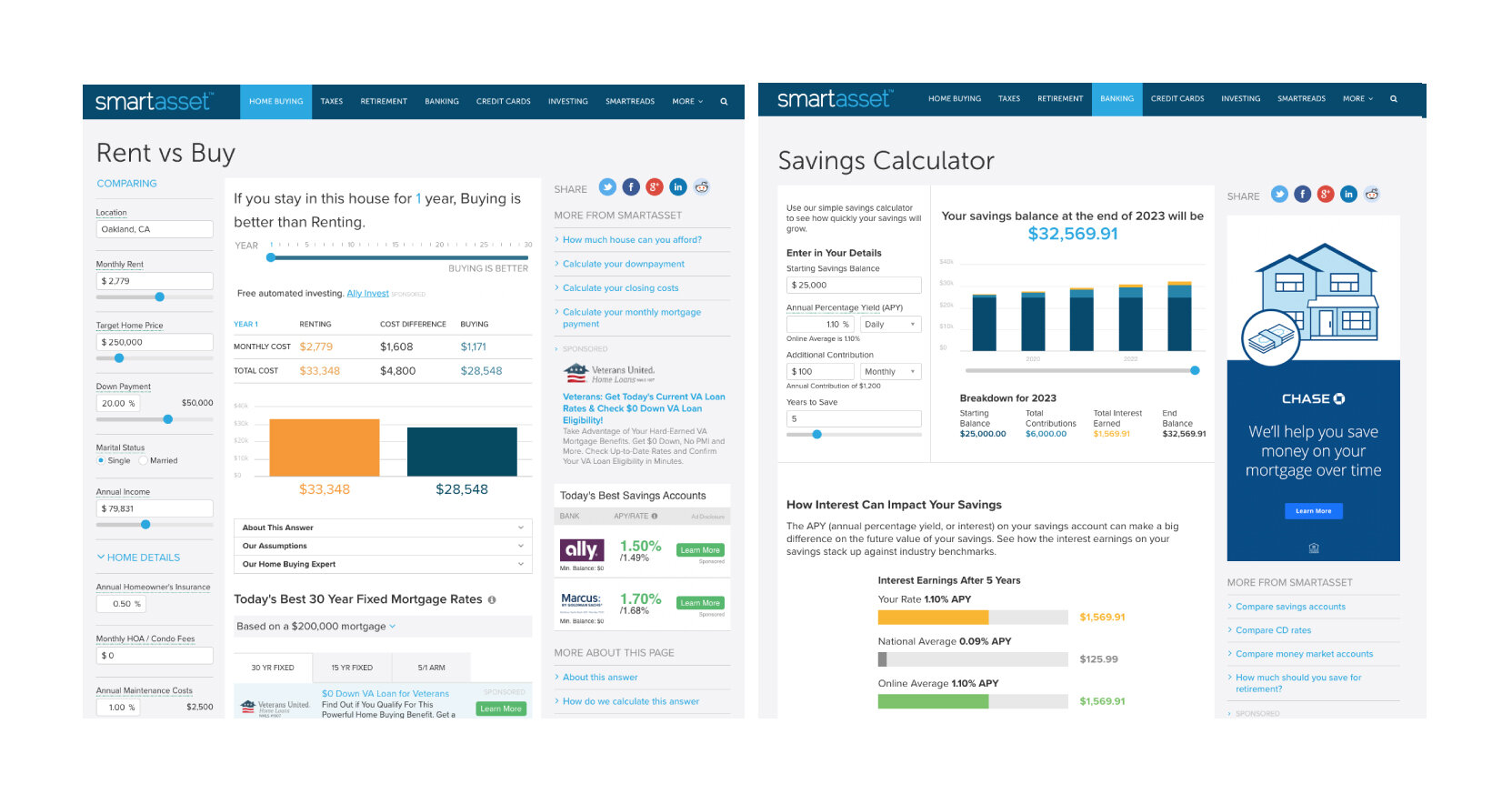
Making personal financial decisions like buying a house and retiring are complicated and can be stressful. Tools like mortgage and retirement calculators can help breakdown the complexity. How might we create a calculator design with various inputs, answers and definitions into a layout that is easy to understand and use? The design layout should be flexible enough to work for tax, banking, credit card, investing, life insurance, and loan calculators, and have a third column for advertising.
We started by getting to know our users. We used google surveys, calculator user data, and industry resources to compile demographics and empathy maps. These weren’t perfect, but they helped us focus on the user’s pain points and wireframe the content hierarchy for the calculators. I led the design team and UX research and collaborated closely with the CEO, product managers, and engineers from initial concepts, design iterations, user testing, and interactive prototypes to pixel-perfect designs in Sketch.
Process


Outcome
The designs met both the user experience, business goals and adaptive responsive sizing requirements. The three column grid was selected to allow for advertising and partnership revenue. The content continues to be updated to align with product strategy, our users’ feedback and SEO considerations.